

The 30-second answer
Here's the whole secret, and it fits on a napkin: I don't need to know a single painter's name to pick art that works, and neither do you. Two things do all the heavy lifting. First, your art is the 10% accent in the classic interior 60-30-10 rule — which means it's allowed, even required, to be the loudest, most confident color in the room, not some timid echo of the sofa. Second, match the temperature of the piece to the room's own light: a cool, north-facing room wants something warm to fight the chill, a sun-drunk south-facing room can carry darker, moodier color without going flat. That's it. Everything below is just me showing my work, with a worked example so you can see the rule actually bite.
1. The 60-30-10 rule, and where art actually sits in it
Designers use a ratio to keep a room from feeling like a yard sale or a hospital waiting room: 60% of the visible color is the dominant note — walls, the big rug, the biggest sofa. 30% is secondary — curtains, an accent chair, a smaller rug — contrast without a fistfight. And 10% is the accent, the note that gives the room its personality, the way a red lipstick finishes an outfit that's otherwise all beige. Throw pillows, lamps, and wall art live in that last 10%, and it's the most fun real estate in the house.
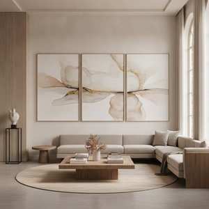
Here's the part people get backwards constantly: art is supposed to be the boldest color in the room. I have watched so many people buy a print that quietly matches the sofa, like it's trying not to get noticed at its own party, and the room ends up flat as a pancake, because nothing is doing the job the rule assigns to that final 10%. Picture a room with warm grey walls (60%, dominant) and a navy sofa (30%, secondary). A grey-and-navy print in that room is a coward. A piece carrying mustard, or coral, or deep bottle green finishes the room, because that's the exact note the math has been waiting for the whole time.
2. Matching the art's temperature to the room's light
Color has a temperature, same as soup. Reds, oranges, yellows run warm; blues, greens, purples run cool. And a room's own natural light already leans one way before a single frame goes up. The direction the room faces changes what that light does to color, and it's worth knowing before you fall in love with a print online:
| Room orientation | Natural light character | What it does to color on the wall | Art that balances it |
|---|---|---|---|
| North-facing | Indirect, soft, consistent through the day, naturally cool/blue-toned | Cool colors (pale blues, greens) can read as flat or even cold | Warm-toned art — reds, oranges, warm yellows, terracotta — adds the warmth the room's own light isn't providing |
| South-facing | Direct, strong sunlight for much of the day, naturally warm | Warm colors get amplified further; the room can absorb more without going flat | Cooler or deeper, more saturated colors stay crisp rather than washing out — this is the room that can carry moodier, darker art |
| East-facing | Bright, warm light in the morning, cooler and dimmer by afternoon | Color shifts through the day | A mid-temperature piece reads reasonably consistent across the day |
| West-facing | Cooler through the day, warm golden light in late afternoon/evening | Similar shift, in reverse | Same logic as east — mid-temperature is the safe default |
Is this a law of physics? No. A north-facing room flooded with bright artificial light behaves nothing like one lit only by its own window, and I'll admit that upfront. But it's the fastest way I know to stop staring at a wall wondering why a print that looked perfect on your laptop looks wrong at seven in the evening. Usually it isn't the wrong picture. It's the wrong temperature for that room's light.
3. Reading a piece for color before you buy it
Three things worth checking on any piece before it commits to your wall forever, and none of them require you to know who painted it, when, or why art historians care.
- What's the dominant color, at a glance, from across the room? Not the smallest detail. The color your eye grabs first from ten feet away, the way you clock a stop sign before you read the word STOP. That's the color doing the 10%-accent job.
- Is it warm or cool overall? Even a mostly neutral piece leans somewhere — a grey landscape can lean warm (sandy, olive undertones) or cool (blue-grey, slate undertones) — and that lean is what needs to agree with, or deliberately fight, the room's light.
- Does it have one strongly saturated note, or is everything muted? A single confident color — a red umbrella in an otherwise soft street scene, a bright sky over a quiet field — does the accent job better than a piece that's uniformly soft. Uniform softness disappears into the wall instead of anchoring the room, the way a whisper disappears in a loud restaurant.
Three questions worth asking before you buy
Should the art match my sofa or contrast with it?
Contrast — genuine difference, not clash. Under the 60-30-10 rule the sofa is usually the 60% or 30%, and the art's job as the 10% is to bring a color those two aren't already carrying. A piece that matches the sofa's exact hue reads as redundant, like ordering the same entree as your date. A piece that shares the room's undertone — both warm, or both cool — while contrasting in actual hue reads as intentional, and intentional is the whole game.
My room doesn't get much natural light — does that change what I should buy?
Yes, and it might be the single most useful fact in this whole article. A dim or north-facing room, where light runs naturally cool and low, tends to flatten pale or cool-toned art into something muddy, like a photo taken through a dirty window. Warmer, more saturated pieces hold their color under weak or artificial light because they never depended on strong daylight to look alive in the first place.
What if I genuinely can't tell warm from cool when I look at a picture?
Look at the whites, greys, or lightest patches, not the obviously colorful bits. A warm piece's "white" sky or wall usually carries a faint yellow, pink, or cream cast — the way a candle-lit room tints everything gold. A cool piece's equivalent patch carries a faint blue, grey, or lavender cast, like snow shadow. Every piece has some neutral area to test this on, and that neutral area doesn't lie the way a big showy color sometimes can.
Related on Mus3ums.com
- Want the deeper dive on the exact idea in section 2? The Emotional Palette: Choosing Art by Color walks the same 60-30-10 logic with more room-by-room examples.
- If "warm room, cool room" clicked for you, Harmony or Contrast? takes the same temperature test into actual paintings, without making you memorize a single name.
- Shopping by feeling rather than by artist is a whole method, not just a hack — Evoking Emotion Through Art: A Guide to Shopping by Mood is the fuller version.
- Curious why some pieces feel hazy and soft instead of confidently saturated? Evoking Mood & Space explains the technique behind that effect, no jargon required.
- Once you've picked a color and mood, the next fork in the road is medium — Giclée Prints vs. Hand-Painted Oils lays out that choice plainly.
- Not sure the color will actually work once it's on your wall? Buy with a safety net — the return policy exists for exactly this kind of second-guessing.
Sources
- The 60-30-10 Rule: A Framework for Balancing Colors — Behr / Colorfully Behr
- Mastering Interior Design: The 60-30-10 Rule for Color Harmony — Whitney Ford Design
- Choosing a Color Scheme: 60-30-10 Rule — ElephantStock
- The Secret to Choosing Paint Colors for North-Facing Rooms — Clare
- Best Paint Colors for South-Facing Rooms — Benjamin Moore
- How Light Affects Colour — Farrow & Ball
- Light Direction and Hue: The Color Compass — Sherwin-Williams / Tinted
- Choosing Color Based on Room Orientation — Sherwin-Williams