I bought a ten-power loupe for about four pounds specifically to write this article, and it has turned out to be the best money I have spent on art in a decade. I now look at everything through it. My friends have stopped inviting me places.
Let me tell you what you see.
The Problem Inherited From the Copying Workshop
A hand-painted copy has one real weakness attached to it: because a person paints every copy individually, no two are ever quite identical, and making forty of them takes as long as making one, forty times over.
That bottleneck barely matters to one person furnishing one room. It matters enormously to a hotel ordering forty matching canvases for forty rooms. Or a school wanting the same reference image in every classroom. Or — and this is the one that will actually apply to you — a family who would like the same picture at three different sizes for three different walls.
No workshop of painters, however brilliantly organised, can solve that order economically.
And this is an old problem, not a new one, which I did not know and rather enjoyed finding out. Long before digital printing, print-sellers were already attacking it with mechanical colour printing: cheap engravings, then colour lithographs, sold in quantity to a middle-class audience who could never afford an original picture or even a competent hand-copy of one.
It worked, after a fashion. And it is worth remembering that "a cheap reproduction for people who cannot afford the real thing" is a trade at least two centuries old. It is not something the internet invented and it is not something to be sniffy about. Your great-great-grandmother had a lithograph over the mantel and she loved it.
Two Problems Those Early Prints Could Not Solve
Early mechanical colour printing hit two separate walls. Keep them separate in your head, because modern printing solves them separately too.
The first was subtlety of colour. Early presses worked with a small number of ink colours, laid down through a coarse screen, so a smoothly graduated passage — an evening sky, a shadowed face — collapsed into visible bands, or into a slightly muddy average of the colours it should have been. The gradation the eye expects simply wasn't there.
The second was permanence, and it is the more stubborn of the two — because it had almost nothing to do with the ink and almost everything to do with the paper underneath it.
Ordinary cheap paper is made largely from wood pulp, and wood pulp contains lignin, the substance that gives a tree trunk its rigidity. Exposed to light and ordinary air, lignin slowly oxidises into new chemical compounds that absorb blue light and reflect back yellow and brown. That is the entire mechanism behind the familiar sight of an old newspaper turning the colour of weak tea.
And the same reaction throws off acidic by-products as it goes — which is why old cheap paper does not merely yellow. It grows brittle, and eventually cracks along its own folds. The paper is digesting itself.
So the inherited problem was a double one: match a painter's subtlety across a smooth gradation of colour, and stop the sheet itself from working against the image printed on it.
Comparing Two Sheets Under the Same Light
Here is where the loupe earns its four pounds. Get one. I am not joking.
Take two objects anyone can hold — an ordinary paper poster, and something sold as a giclée print — and put them under the same lamp.
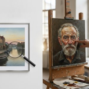
Hold each about eight inches from the light and look at a patch of even, mid-toned colour through the magnifier.
On the cheaper sheet, the colour resolves into a small, perfectly regular grid of dots in four colours, laid down at fixed angles so that from ordinary viewing distance they blend by eye into continuous tone. This is a halftone screen — the same principle used to print newspapers and magazines for over a century — and under a loupe it is unmistakable. A repeating, mechanical grid. Once you have seen it you cannot unsee it, and you will start noticing it on menus.
On the other sheet, the dots are not in a grid at all. They form a fine, irregular spray, denser in the darker passages and sparser in the light ones, with no repeating pattern to be found anywhere — because they were not stamped through a fixed screen. They were sprayed, drop by microscopic drop, directly from a moving print head that puts ink exactly where the file tells it to and nowhere else.
Now run a finger over both.
The texture on the giclée is completely uniform — exactly the same whether your finger crosses a patch of sky or a patch of deep shadow — because the machine treats the whole surface identically, laying the same weight of ink everywhere the file calls for it.
That uniformity is itself a signature. It is the thing that tells you, whatever material the sheet happens to be mounted on, canvas very much included, that you are holding a print and not a painting. No ridge. No catch under the fingertip. The whole surface agreeing with itself, perfectly, everywhere.
What the Engineers Worked Out, and What It Demanded in Return
The word everyone now uses has a specific and rather charming origin.
Giclée was coined in 1991 by a printmaker named Jack Duganne, working at a print studio called Nash Editions, for output from a modified drum printer originally built for entirely different industrial purposes. Duganne wanted a word that separated this new, careful process from ordinary office printing — and settled on the French verb gicler, to spray or to squirt, because that is a fair description of what the machine physically does.
A printmaker in 1991 needed a word that didn't sound like a fax. He picked a French one. It worked so well that thirty-five years later people say it in shops without knowing they are saying "squirt."
What the process actually solved, underneath the new name, was both old problems at once:
- Pigment instead of dye. Dye is colourant dissolved directly in liquid — bright, cheap, and doomed, because ultraviolet light attacks the dye molecule directly and it breaks down within a few years. Pigment is tiny solid particles of colourant, chemically far more stable, held onto the surface by a resin rather than soaked into it.
- Eight to twelve ink colours instead of four. Which is exactly what lets a smoothly graduated sky stay smooth rather than banding.
- Cotton fibre instead of wood pulp, with the lignin removed at the papermaking stage — acid-free from the outset, so there is nothing in the sheet working against the image on it.
Independent testing bears this out, but the figures deserve a careful reading rather than a headline glance, and this is the bit vendors quote badly.
The standard reference in the field is a laboratory that has run comparative print-permanence testing since 1971. Its ratings assume the print is displayed under fairly bright light, for twelve hours a day — considerably brighter than most rooms in an ordinary home ever get — and they measure how long it takes before a person can first notice any fading under those conditions.
Under that test, a well-made pigment print on an acid-free substrate commonly rates at sixty to a hundred years or more before visible fading. And because most homes are dimmer than the test conditions, the real figure on an ordinary wall tends to run longer, not shorter.
That is a crude summary of testing methods that took decades to refine. But it explains why the claim, made honestly, is a meaningful one rather than an advertising flourish. Somebody put a print under a lamp and waited.
What it demands of you
Here is the catch, and it is entirely your problem rather than the printer's.
Because the printer copies the digital file with total fidelity, it copies every fault in that file with total fidelity too.
A print made from a small, low-resolution photograph, enlarged far past the size the file was ever meant to support, will look soft and indistinct no matter how magnificent the printer — in exactly the way a snapshot from an ordinary camera turns visibly grainy once it is blown up to poster size.
The printer cannot invent detail the file never captured. Nothing can. This is the one place where "you get what you pay for" is completely the wrong frame: you get what you supply.
What a Giclée Costs
At the sizes commonly ordered, base prices for a pigment giclée on canvas come out roughly like this, before frame or shipping:
| Canvas size | Base price |
|---|---|
| 12 × 16 in (30.5 × 40.6 cm) | $49 |
| 16 × 20 in (40.6 × 50.8 cm) | $55 |
| 20 × 24 in (50.8 × 61 cm) | $62 |
| 24 × 36 in (61 × 91.4 cm) | $79 |
| 30 × 40 in (76.2 × 101.6 cm) | $94 |
| 36 × 48 in (91.4 × 121.9 cm) | $118 |
| 48 × 72 in (121.9 × 182.9 cm) | $195 |
Set that beside a hand-painted canvas at the same sizes — $214 where this says $55, $320 where this says $79 — and the economic argument sits in two columns. Roughly a quarter of the price, for something that will outlast most of the furniture in the room. What you give up is the ridge.
Head to Head: Who Prints, Who Paints, and Who Won't Say
Three atelier retailers, three independent reproduction specialists, and one museum that does nothing else.
| Vendor | Print offer | Observed print price | Hand-painted alongside? | Shipping | Returns |
|---|---|---|---|---|---|
| Mus3ums.com | Pigment giclée on canvas and paper | $55 at 16 × 20 in (40.6 × 50.8 cm); $79 at 24 × 36 in (61 × 91.4 cm) | Yes — full oil commission channel | Free worldwide, in the price | 30-day money-back |
| ArtsDot.com | Giclée on canvas and paper, size- and format-first | Comparable network pricing | Yes | Free worldwide, in the price | 30-day money-back |
| BuyPopArt.com | Giclée and acrylic face-mount for flat saturated colour | Comparable network pricing | Yes | Free worldwide, in the price | 30-day money-back |
| TOPofART | Giclée on canvas and art paper | Canvas €55.33; paper €52.39 | Yes — oils at €944–€1,084 | Not on the landing page | Policy exists; see returns page |
| MFA Images (Museum of Fine Arts, Boston) | Archival pigment replicas on rag paper or cotton canvas, framing options | By order form / mfaprints.org | No — printing only | By arrangement | By arrangement |
| Reproduction Gallery | None — hand-painted oil only | n/a | Yes, exclusively: $299–$329 at ~75 × 75 cm | Free worldwide (DHL / FedEx) | 45-day refund or replacement |
| Fabulous Masterpieces (UK) | None — hand-painted oil only | n/a | Yes: from £197 + VAT | Free worldwide delivery | Not stated on the landing page |
Look at the two rows I find most instructive, sitting at opposite ends.
Reproduction Gallery sells only hand-painted oil — forty thousand paintings, seven hundred artists, not a print in sight. And the Museum of Fine Arts, Boston sells only archival pigment prints, and hand-paints nothing at all.
Two organisations, both entirely serious, reaching precisely opposite conclusions about how to give somebody a picture they can't otherwise have. Neither is wrong. They have simply decided which of the two problems in this article matters more — texture, or fidelity — and committed completely.
Everyone in the middle of that table is letting you choose. Which is generous, and also means the choice is now yours, which is the mildly annoying part.
Three Questions Worth Asking Before Ordering One
Is "giclée" a genuine technical standard, or just a nicer word for an inkjet print?
Both things are true at once, and you have to hold both. The word was coined for a specific, careful process in 1991 — but it has never carried a legal definition, and nobody certifies its use. Any inkjet output on earth can be called a giclée, whatever ink or paper produced it.
The word proves nothing. The specification behind it does. Confirm three things: pigment rather than dye ink, eight or more ink channels rather than four, and an acid-free cotton or canvas substrate. If a seller can't answer those, the French is doing all the work.
How long will this really last on the wall?
Under laboratory conditions — a lamp far brighter than most living rooms, running twelve hours a day — a well-made pigment print on an acid-free substrate typically takes sixty to a hundred years, sometimes longer, before a person first notices fading. Because home lighting is usually dimmer and shorter in duration than the test, the real figure on your wall tends to be longer than the published rating, not shorter.
Why do two canvases of the same picture cost such different amounts?
Because the specification behind the word is not fixed. Three things drive it: how many separate ink colours the printer uses; whether the substrate is genuinely acid-free cotton or canvas rather than an ordinary coated fabric; and — the one variable entirely outside the print shop's control — whether the digital file itself carries enough resolution to be enlarged to the size ordered without going soft.
The New Problem This Solution Creates
Everything about a giclée depends on the file. And the print itself is flawlessly, mechanically uniform across its whole surface.
Which means it can never give you the one thing the hand-painted copy gave without even trying: a surface with genuine relief, a thing subtly different from every other copy of it.
A giclée solves accuracy and permanence about as completely as either problem can be solved. It does not, and by its own nature cannot, solve texture. There is no premium tier that fixes this. There is no better printer coming.
A buyer who wants the ridge back has exactly one route, and it is backwards: return to the paintbrush.
Where This Leaves the Next Problem
Solving accuracy and permanence still leaves one large question completely untouched — and it is the question a student or a researcher asks long before a collector does.
Where does a good file come from in the first place? And what happens if you would rather choose your own paper, your own size, and your own framer, instead of accepting whatever a print shop offers ready-made?
Licensing a digital file directly, or buying a plain paper poster, answers both: the format is built for the exact opposite priority to everything discussed here. Not permanence. A low price, for a wall that is expected to change its mind.
Further Reading
- Turn Your Photos into Custom Oil Paintings — the other side of the file-quality problem, where resolution decides everything.
- Beyond the Print: Why Hand-Painted Oil Masterpieces Outshine Digital Reproductions — the strongest available argument against this article.
- From Blurry to Brilliant — what a low-resolution file can and cannot be rescued into.
- Mastering Art Collecting: Acquiring Museum-Quality Famous Reproductions — distinguishing hand-painted from printed, at collection scale.
Sources
- Giclée — Wikipedia
- Guide to Giclee Prints — Printique (Adorama)
- Inkjet/Giclée Print Process: late 1900s–today — The Historic New Orleans Collection
- An Overview of WIR Print Permanence Ratings (PDF) — Wilhelm Imaging Research
- Epson SureColor P7000/P9000 Print Permanence Ratings (PDF) — Wilhelm Imaging Research
- Why Paper Turns Yellow Over Time — Paper Archive Care
- What Makes a Long-Lasting Art Paper? — Jackson's Art
- TOPofART, MFA Images archival replicas, Reproduction Gallery and Fabulous Masterpieces — vendor claims and prices as published, August 2026.
- Network print prices quoted live from the published Mus3ums.com order pages, August 2026, before frame, with worldwide shipping included.