The Architecture of Absence: Defining Negative Space and 'Ma'
 Ma (negative space)
Ma (間, lit. 'gap, space, pause') is a Japanese concept of negative space, and a Japanese reading of the Sino-Japanese character 間. == Ma in Japanese culture == In modern interpretations of traditional Japanese arts and culture, ma is an artistic inte...
In large-scale hospitality design, the void is rarely empty; it is a functional component of the structural narrative. To understand negative space is to recognize that the area surrounding a subject carries as much weight as the subject itself. In the West, we often refer to this as white space or air space, but the Japanese concept of
ma offers a more profound architectural perspective. It is not merely a gap or an interval; it is a purposeful pause that gives shape to the whole. Whether observing the distance between two fighters in karate or the intentional stillness between flowers in ikebana,
ma teaches us that the space we leave unoccupied is what allows the occupied space to breathe and hold meaning.
This principle of intentional emptiness finds its most rigorous expression in minimalist photography and abstract painting. When a photographer like Michael Kenna or Hiroshi Sugimoto utilizes a sparse composition, they are not simply omitting detail; they are using monochromatic elements and texture to direct the eye toward a singular, potent truth. In design, ignoring this concept leads to visual clutter that exhausts the guest. By treating the "empty" parts of a room as active participants in the composition, we create environments that offer a place for the eye to rest.
Takeaway: Treat empty space as an active structural element rather than a vacuum.
First Consideration: Establishing Spatial Balance and Visual Breath
 Helen Gerardia
Helen Gerardia: Architect of Negative Space Born in Ekaterinoslav, Russia – now Dnipropetrovsk – in 1903, Helen Gerardia’s artistic journey was one shaped by both a rich cultural heritage and the transformative experiences of immigration. Her early l...
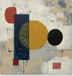
When approaching a new installation, the first decision point involves assessing the density of the surrounding environment. A room filled with heavy textures, patterned wallpapers, and complex lighting requires a counterweight of simplicity to prevent sensory overload. This is where the geometric precision of artists like Helen Gerardia becomes an essential reference. Her work, shaped by the rigorous teachings of Hans Hofmann, utilizes carefully constructed diagrams of form and void. By manipulating negative space through geometric structures, she reveals underlying architectural truths that mirror the very blueprints used in modern construction.
Achieving balance requires a disciplined approach to what is excluded. In graphic design, the legibility of typography relies entirely on the judicious use of white space; similarly, a large-scale lobby relies on the "breathing room" between furniture groupings and wall art. We see this tension beautifully executed in the works of Friedrich Vordemberge-Gildewart, where the interplay between De Stijl principles and geometric abstraction creates a sense of universal harmony. The goal is to find a equilibrium where the positive space—the objects, the furniture, the art—does not overwhelm the viewer but instead exists in a state of controlled tension with the surrounding air.
Takeaway: Use minimalist compositions to provide visual relief in high-density environments.
Next Step: Selecting Singular Focal Points for Guest Impact
 Top 25 Masterpieces by Laurent Fabre: A Journey Through Neo-Abstract Geometry
Introduction To step into the world of Laurent Fabre is to enter a space where the rigid boundaries of geometry dissolve into a luminous dance of color and light. His work does not merely occupy a wall; it commands the atmosphere, inviting the viewer...
Once the spatial balance is established, the next phase involves the selection of a focal point that commands attention without demanding noise. A successful focal point in a large-scale space acts as an anchor. In minimalist photography, this is achieved through a strong, singular subject set against a vast, uncluttered background. For a hospitality professional, this might translate to a single, large-format abstract work that utilizes a restrained palette—perhaps predominantly black and white—to draw the eye toward a specific architectural feature or seating area.
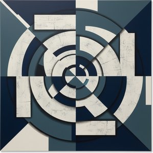
The impact of such a choice is magnified when the artwork possesses an internal logic of focus. Consider the works of Laurent Fabre, where a sweeping arc of deep crimson might orbit a deconstructed landscape of alabaster. Such a piece does not merely occupy a wall; it orchestrates the atmosphere of the entire room. The presence of a singular, powerful color or shape provides a destination for the guest's gaze, creating an impression of sophistication and intentionality. This prevents the "visual wandering" that occurs in poorly curated spaces, replacing confusion with a sense of directed discovery.
Takeaway: A single, well-placed focal point can anchor an entire room's aesthetic identity.
Expanding the Narrative: The Utility of Multi-Panel Series and Rhythmic Repetition
![Abstract Composition [triptych]](/media/artworks/images-thumb/08/3c/083c0675045645fd42d4e6c6d63f1ced.jpg) Abstract Composition [triptych]
Abstract Composition [triptych]Abstract Composition [Triptych] by Vaclav Vytlacil (1937). Explore this dynamic black & white triptych featuring bold lines, textures & geometric shapes. A key example of American modernism.
For expansive walls or long corridors, a single canvas often lacks the necessary scale to influence the architecture. This is where the "multi-panel" trend becomes a logistical and aesthetic advantage. Utilizing triptychs or larger series allows for the distribution of visual weight across a wider area, creating a rhythmic pulse that guides movement through a space. We see this in the dynamic black and white structures of Vaclav Vytlacil’s
Abstract Composition, where the division of the image across multiple panels creates a sense of momentum.
This technique finds its sonic parallel in minimalist music. Composers like Steve Reich use repetition, phase-shifting, and steady pulses to create a hypnotic, non-narrative experience. In a design context, repeating certain geometric motifs or color intervals across a series of paintings can mimic this rhythmic effect. The work of Fritz Klingbeil, for instance, uses repeated symbols and precise shapes against white backgrounds to create an experience that is both intellectually stimulating and visually cohesive. When these elements are scaled correctly, they transform a corridor from a mere transition zone into a curated gallery experience.
Take Takeaway: Use multi-panel series to extend visual rhythm across large architectural spans.
Final Decision: Integrating Texture and Materiality for Durability
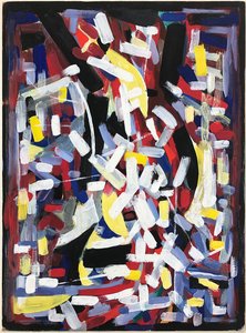 Abstract Composition
A Symphony of Chaos and Color In the realm of mid-century abstraction, few works capture the raw, unbridled energy of the human spirit quite like Hryhorii Havrylenko’s Abstract Composition . Created in 1975, this masterpiece serves as a profound test...
The final decision in any procurement process must reconcile aesthetic intent with the realities of long-term maintenance and durability. While minimalism emphasizes sparseness, it should never imply a lack of tactile depth. The "soul" of a high-quality reproduction lies in its materiality—the visible brushstrokes and the impasto texture that distinguish a hand-painted oil from a flat print. In a high-traffic hotel or restaurant, the physical presence of the art—its ability to catch light through ridges and valleys—adds a layer of luxury that resists the perceived "flatness" of modern digital environments.
When selecting works for large-scale installations, consider how texture interacts with ambient lighting. A heavy impasto technique, as seen in the energetic works of Hryhorii Havrylenko, creates a three-dimensional relief that changes character as the day progresses. Furthermore, ensure that the chosen medium is robust; our hand-painted oils on 100% cotton canvas are finished with Damar varnish to protect against dust and atmospheric pollutants. Whether you are implementing a massive mural or a series of framed canvases, the integration of texture ensures that the minimalist aesthetic remains a sophisticated, permanent fixture rather than a transient trend.
Takeaway: Prioritize tactile textures and high-quality finishes to ensure long-term visual impact and durability.