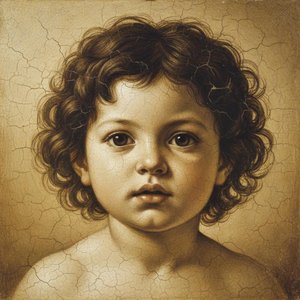
A hand-painted copy has one real weakness: because a person paints every copy individually, no two copies are ever quite identical, and producing many of them takes as long as producing one, repeated over and over. That bottleneck barely registers to a single buyer furnishing a single room. It matters enormously to a hotel ordering forty matching canvases for forty rooms, or a school wanting the same reference image in every classroom, or just a family that wants the same picture at three different sizes for three different walls. No workshop of painters, however well organised, solves that kind of order economically. Nobody's hiring forty guys with forty identical brushes.
This is an old problem, not a new one either. Long before digital printing, print-sellers already tried to solve it with mechanical colour printing — cheap engravings and, later, colour lithographs, sold in bulk to a middle-class audience that could never afford an original picture or even a competent hand copy of one. It worked, after a fashion, and it's worth remembering that "a cheap reproduction for people who can't afford the real thing" is a trade at least two centuries old, not something the internet invented last Tuesday.
Two problems those early mechanical prints could not solve
Early mechanical colour printing ran into two separate walls, and it's worth keeping them separate because modern printing solves them separately too.
The first was subtlety of colour. Early presses worked with a small number of ink colours, laid down through a coarse screen, so a smoothly graduated passage — an evening sky, a shadowed face — tended to collapse into visible bands or a slightly muddy average colour instead of the gentle gradation your eye actually expects.
The second, and the more stubborn of the two, was permanence, and it had less to do with the ink than with the paper underneath it. Ordinary cheap paper is made largely from wood pulp, and wood pulp contains a substance called lignin — the stuff that gives a tree trunk its rigidity. Exposed to light and ordinary air, lignin slowly oxidises into new chemical compounds that absorb blue light and reflect back yellow and brown, and that's the entire mechanism behind an old newspaper turning the colour of weak tea in a drawer nobody opened for a decade. The same reaction throws off acidic by-products as it goes, which is why old cheap paper doesn't just yellow — it eventually goes brittle and cracks along its folds like a dead leaf. So the problem facing anyone building a modern printer was a double one: match a painter's subtlety across a smooth gradation of colour, and stop the sheet itself from working against the image printed on it.
Comparing two sheets under the same light
Let's compare two printed sheets directly, side by side, under the same lamp — not two paintings, since neither's in front of us, but two objects anyone can actually hold: an ordinary paper poster, and what's sold today as a giclée print.
Hold each about eight inches from a bright light and look at a patch of even, mid-toned colour through a small magnifying glass — an inexpensive ten-power loupe does the job fine. On the cheaper sheet, the colour resolves, under magnification, into a small and perfectly regular grid of dots in four colours, laid down at fixed angles so that from ordinary viewing distance they blend by eye into a continuous tone. That's called a halftone screen, the same principle that's printed newspapers and magazines for decades, and under a loupe it's unmistakable — a repeating, mechanical grid, like graph paper someone colored in. On the other sheet, the dots aren't arranged in a grid at all. They form a fine, irregular spray, denser in the darker passages and sparser in the light ones, with no repeating pattern anywhere, because they're not stamped through a fixed screen but sprayed, drop by microscopic drop, directly from a moving print head that puts ink exactly where the file tells it to and nowhere else.
Now run a finger over both. The texture on the giclée sheet is completely uniform — exactly the same whether your finger crosses a patch of sky or a patch of deep shadow — because the machine treats the whole surface identically, laying down the same weight of ink everywhere the file calls for it. That uniformity is itself a kind of signature. It's what tells you, whatever material the sheet happens to be mounted on, canvas included, that you're holding a print and not a painting.
The solution engineers worked out, and what it demanded in return
The word most people use for this kind of print, giclée, has a specific, traceable origin: it was coined in 1991 by a printmaker named Jack Duganne, working at a print studio called Nash Editions, for output from a modified drum printer originally built for other industrial purposes. Duganne wanted a word that separated this new, careful process from ordinary office printing, and landed on the French verb gicler — to spray, or to squirt — because that's a fair description of what the machine physically does.
What the process actually solved, underneath the fancy new name, was the two old problems at once. In place of dye — colourant dissolved directly in a liquid, which produces bright, cheap colour but breaks down within a few years because ultraviolet light attacks the dye molecule directly, the same way your car's dashboard fades — the new machines used pigment: tiny solid particles of colourant, chemically far more stable, held onto the surface by a resin instead of just soaking in. Instead of four ink colours, the better machines used eight to twelve, which is what lets a smooth graduated sky stay smooth instead of banding. And instead of ordinary wood-pulp paper, the substrate became cotton fibre with the lignin removed at the papermaking stage — acid-free from the outset, so there's nothing in the sheet itself working against the image printed on it.
Independent testing backs this up, though the figures deserve a careful read rather than a headline glance. The standard reference in the field is a laboratory that's run comparative testing since 1971, and its ratings assume the print is displayed under fairly bright light — twelve hours a day, considerably brighter than most rooms in an ordinary home ever get — and measure how long it takes before a person first notices any fading under those conditions. Under that test, a well-made pigment print on an acid-free substrate commonly rates at sixty to a hundred years or more before visible fading, and because most homes are dimmer than the test conditions, the real figure on an ordinary wall tends to run longer still, not shorter. That's the simplified version of testing methods that took decades to refine, but it explains why the claim, made honestly, is a meaningful one rather than an advertising flourish.
But the solution demanded something new of the customer in return. Because the printer copies the digital file with total fidelity, it also copies every fault already sitting in that file with total fidelity. A print made from a small, low-resolution photograph, enlarged far past the size the file was ever meant to support, will look soft and indistinct no matter how good the printer is — the same way a snapshot from an ordinary camera turns visibly grainy once you blow it up to poster size. The printer can't invent detail the file never captured in the first place.
At the sizes commonly ordered, base prices for a pigment giclée on canvas come out roughly like this, before frame or shipping:
| Canvas size | Base price |
|---|---|
| 12 × 16 in (30.5 × 40.6 cm) | $49 |
| 16 × 20 in (40.6 × 50.8 cm) | $55 |
| 20 × 24 in (50.8 × 61 cm) | $62 |
| 24 × 36 in (61 × 91.4 cm) | $79 |
| 30 × 40 in (76.2 × 101.6 cm) | $94 |
| 36 × 48 in (91.4 × 121.9 cm) | $118 |
| 48 × 72 in (121.9 × 182.9 cm) | $195 |
Three questions worth asking before ordering one
Is "giclée" a genuine technical standard, or just a nicer word for an inkjet print?
Both things are true at once, and it's worth holding both. The word was coined for a specific, careful process in 1991, but it's never carried a legal definition, and nobody certifies its use — any inkjet output can be called a giclée, whatever ink or paper produced it. The word itself proves nothing; the spec behind it does. Pigment rather than dye ink, eight or more ink channels rather than four, and an acid-free cotton or canvas substrate are the things worth confirming before you take the word at face value.
How long will this really last on the wall?
Under laboratory test conditions — a lamp far brighter than most living rooms, running twelve hours a day — a well-made pigment print on an acid-free substrate typically takes sixty to a hundred years, sometimes longer, before a person first notices fading. Because home lighting is usually dimmer and shorter in duration than the test, the real figure on an ordinary wall tends to be longer, not shorter, than the published rating.
Why do two canvases of the same picture, from two different print shops, cost such different amounts?
Because the spec behind the word "giclée" isn't fixed, and three things drive the difference: how many separate ink colours the printer uses, whether the substrate is genuinely acid-free cotton or canvas rather than an ordinary coated fabric, and — the one variable entirely outside the print shop's control — whether the digital file itself carries enough resolution to be enlarged to the size ordered without going soft.
The new problem this solution creates
Because everything about a giclée depends on the file, and because the print itself is flawlessly and mechanically uniform across its whole surface, it can never give you the one thing a hand-painted copy gives without even trying: a surface with genuine relief, a thing subtly different from every other copy of it. A giclée solves accuracy and permanence about as completely as either problem can be solved. It does not, and by its own nature cannot, solve texture. If you want that back, there's only one route: return to the paintbrush.
Where this leaves the next problem
Solving accuracy and permanence still leaves one big question untouched, and it's the question a student or a researcher tends to ask before a collector does: where does a good file come from in the first place, and what happens if you'd rather choose your own paper, your own size, and your own framer, instead of accepting whatever a print shop offers ready-made?
Related on Mus3ums.com
- Still want to see what the fuss over surface actually looks like? Van Gogh's The Starry Night is the classic case for hand-painting over printing.
- Once it's framed and hung, here's what actually protects it long-term: Framing Perception.
Sources
- Giclée — Wikipedia
- Guide to Giclee Prints — Printique (Adorama)
- Inkjet/Giclée Print Process: late 1900s–today — The Historic New Orleans Collection
- An Overview of WIR Print Permanence Ratings (PDF) — Wilhelm Imaging Research
- Epson SureColor P7000/P9000 Print Permanence Ratings (PDF) — Wilhelm Imaging Research
- Why Paper Turns Yellow Over Time — Paper Archive Care
- What Makes a Long-Lasting Art Paper? — Jackson's Art